A new look for ECONO
With the new season comes a new look for ECONO – a new logo, fresh design, and a more confident presence on the market.
With this refreshed identity, we want to give our story new momentum.
The new logo brings a modern touch to our bike lineup and strengthens our position among the many brands on today’s market.
Our goal remains the same: to work closely with specialized retailers, complement other recognized brands, and continue being the leading e-bike manufacturer in our region.
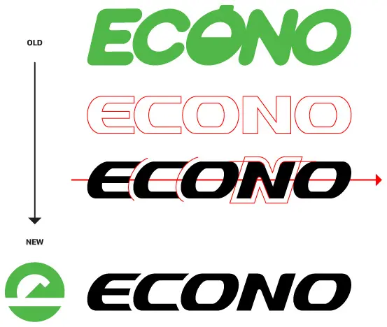
Process of the mark
Our new logo represents movement, progress, and confidence.

The refreshed wordmark features sharper lines and a more dynamic, italic design. Symbolizing speed, energy, and forward motion.
Just like our team and our products, the logo reflects our drive toward the future.
It captures the spirit of innovation and motion that defines ECONO e-bikes. Bikes built to move, explore, and inspire.
The meaning behind the symbol
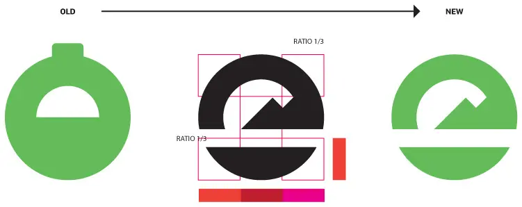
The new ECONO symbol builds on our previous design, which was also based on a circular shape. The circle represents balance — a key element both in cycling and in our philosophy.

Inside the circle, the stylized mountain peaks symbolize the hills and Pohorje mountains that surround our home region. The diagonal line cutting through the circle represents the Drava River — the natural flow that runs through our area — and also embodies the idea of movement and energy.
Together, these elements subtly form the lowercase letter e, the core letter of ECONO, and can also be seen as a rising sun — a symbol of a new beginning and forward motion.